Difference between revisions of "Talk:Tough Break Update"
(→Gravity Falls logo with Tough Break Update logo?) |
|||
| Line 4: | Line 4: | ||
:I noticed that too, but I think it's probably just a coincidence considering that most logos such as this tend to have a similar design. [[File:Paint Splat TheValueOfTeamwork.png|20px|link=User talk:ClockworkSpirit2343]] [[User:ClockworkSpirit2343|<font color="993443"><big>'' '''ClockworkSpirit2343''' ''</big></font>]] [[File:Scout emblem RED.png|25px|link=]] 19:35, 21 December 2015 (PST) | :I noticed that too, but I think it's probably just a coincidence considering that most logos such as this tend to have a similar design. [[File:Paint Splat TheValueOfTeamwork.png|20px|link=User talk:ClockworkSpirit2343]] [[User:ClockworkSpirit2343|<font color="993443"><big>'' '''ClockworkSpirit2343''' ''</big></font>]] [[File:Scout emblem RED.png|25px|link=]] 19:35, 21 December 2015 (PST) | ||
:: It's more like postcard font. — The preceding assigned comment was added by '''[[User:Tark|Tark]]''' '''{'''[[User talk:Tark|Finish Him!]] ▪ [[Special:Contributions/Tark|Contribs]]'''}''' 19:48, 21 December 2015 (PST) | :: It's more like postcard font. — The preceding assigned comment was added by '''[[User:Tark|Tark]]''' '''{'''[[User talk:Tark|Finish Him!]] ▪ [[Special:Contributions/Tark|Contribs]]'''}''' 19:48, 21 December 2015 (PST) | ||
| + | :::Both the Gravity Falls and the Tough Break logos are meant to resemble vintage "Greetings From" postcards. | ||
| + | https://c1.staticflickr.com/9/8491/8391081585_8096603f43_b.jpg | ||
| + | :::There isn't really a standard font, but the the Tough Break logo looks like it uses a 3D version of this one. (http://www.ffonts.net/Vacation-Postcard-NF.font) [[File:User_Upgrade_Signature.png|link=User:Upgrade]] 22:17, 21 December 2015 (PST) | ||
Revision as of 06:17, 22 December 2015
Gravity Falls logo with Tough Break Update logo?
Did anyone noticed that both of these logos are extremely similar? Should this be on the Trivia on this page?
Look on Google to see the logo, I forgot how to link properly without showing the picture here. ![]() ▪
▪ ![]() -
- ![]() 19:20, 21 December 2015 (PST)
19:20, 21 December 2015 (PST)
- I noticed that too, but I think it's probably just a coincidence considering that most logos such as this tend to have a similar design.
 ClockworkSpirit2343
  19:35, 21 December 2015 (PST)
- It's more like postcard font. — The preceding assigned comment was added by Tark {Finish Him! ▪ Contribs} 19:48, 21 December 2015 (PST)
- Both the Gravity Falls and the Tough Break logos are meant to resemble vintage "Greetings From" postcards.
- It's more like postcard font. — The preceding assigned comment was added by Tark {Finish Him! ▪ Contribs} 19:48, 21 December 2015 (PST)
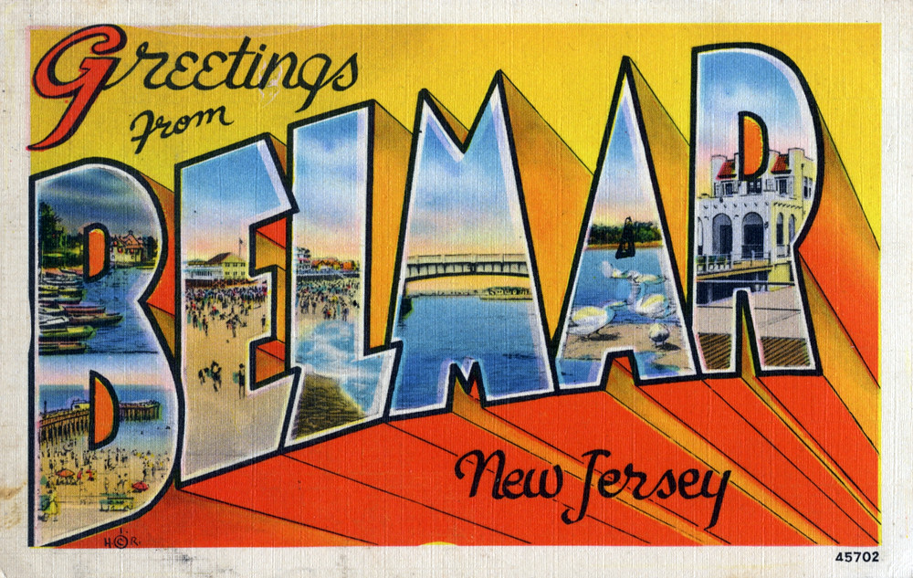
- There isn't really a standard font, but the the Tough Break logo looks like it uses a 3D version of this one. (http://www.ffonts.net/Vacation-Postcard-NF.font)
 22:17, 21 December 2015 (PST)
- There isn't really a standard font, but the the Tough Break logo looks like it uses a 3D version of this one. (http://www.ffonts.net/Vacation-Postcard-NF.font)